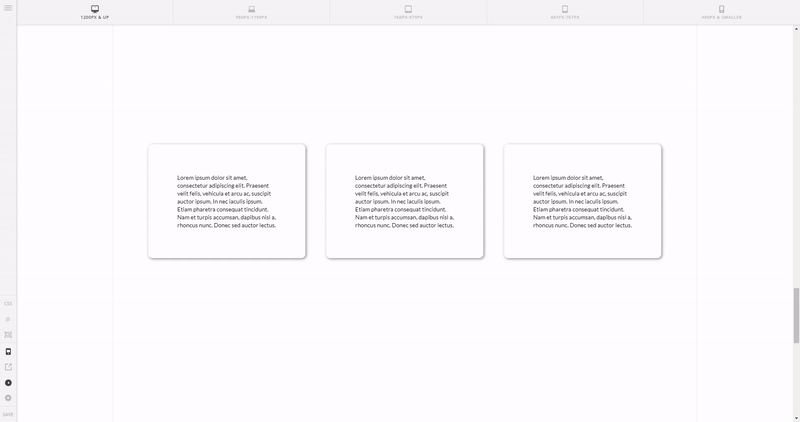
Issue:
Solution 1.
Add this CSS to each column’s Element CSS:
@media (max-width: 767px) {
    $el {
        margin-bottom: 1.63em;
    }
}
Solution 2.
Set a class to the row that contains the columns then add a CSS code targetting the columns using the class added the row like this:
@media (max-width: 767px) {
    .gap-mobile .x-column {
        margin-bottom: 1.63em;
    }
}
The code above will add a bottom margin to the columns on mobile if the class gap-mobile is added to the row’s (that contains the columns) class field.
To make the code take effect in all columns on mobile through the site, use the code:
@media (max-width: 767px) {
     .x-column {
          margin-bottom: 1.63em;
     }
}
Reference links for the solutions above:
- Element CSS – https://theme.co/apex/forum/t/features-element-css/20500
- CSS Media Queries – https://www.w3schools.com/css/css_rwd_mediaqueries.asp
- CSS Class – https://www.w3schools.com/cssref/sel_class.asp
- CSS Margins – https://www.w3schools.com/css/css_margin.asp